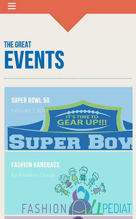
A mobile-first, responsive events listing page built with vanilla HTML and CSS. Features a fixed header with hamburger navigation, a bold typographic hero section, and a scrollable card-based layout showcasing featured events with full-bleed background imagery, event titles, and dates. The design uses a clean color-blocked aesthetic with distinct background tones per card to visually separate content sections, and prioritizes readability with high-contrast white text over image overlays.
Key highlights:
- Fully responsive layout optimized for mobile viewports
- Card-based content structure for easy scanning of event listings
- Custom typography hierarchy (bold display headings + subtext)
- Simple, semantic HTML structure with no framework dependencies
Here’s a mobile screenshot of the project: